
 When a user visits your website, one of their primary objectives is finding the information they want quickly and easily. It doesn’t matter if they’re researching a topic, buying a product or simply validating you as a potential vendor, in most cases, your users are on a mission. The navigation style your site uses can either make their experience efficient and engaging or clunky and frustrating.
In this post, we’ll explore a few navigation options to make your site more effective and give your users a helpful browsing experience.
Once a user shows up on your site, they won’t immediately start clicking. They will instantaneously evaluate whether or not they even like the site…then they’ll start making decisions. The aesthetic graphic design, such as eye-catching colors, fonts and images, has to grab your website visitor’s attention, or they may bounce – the technical term for a visitor seeing your page and immediately leaving your site.
Assuming your design has gotten the visitor’s attention, the content must also be easily accessible. This is where intuitive navigation comes in.
There is no ideal structure or functionality to navigation that every site must adopt. Each site’s target audience is different from the next. However, there are several ways to effectively use navigation both on a traditional desktop and a responsive website – a few of which I have shared below:
Desktop – LeBauer HealthCare
LeBauer HealthCare is a multi-specialty health network covering the Piedmont area of North Carolina. Their website makes use of two great features to communicate the breadth of their coverage – mega menus and targeted call outs.
Mega Menu Website Navigation
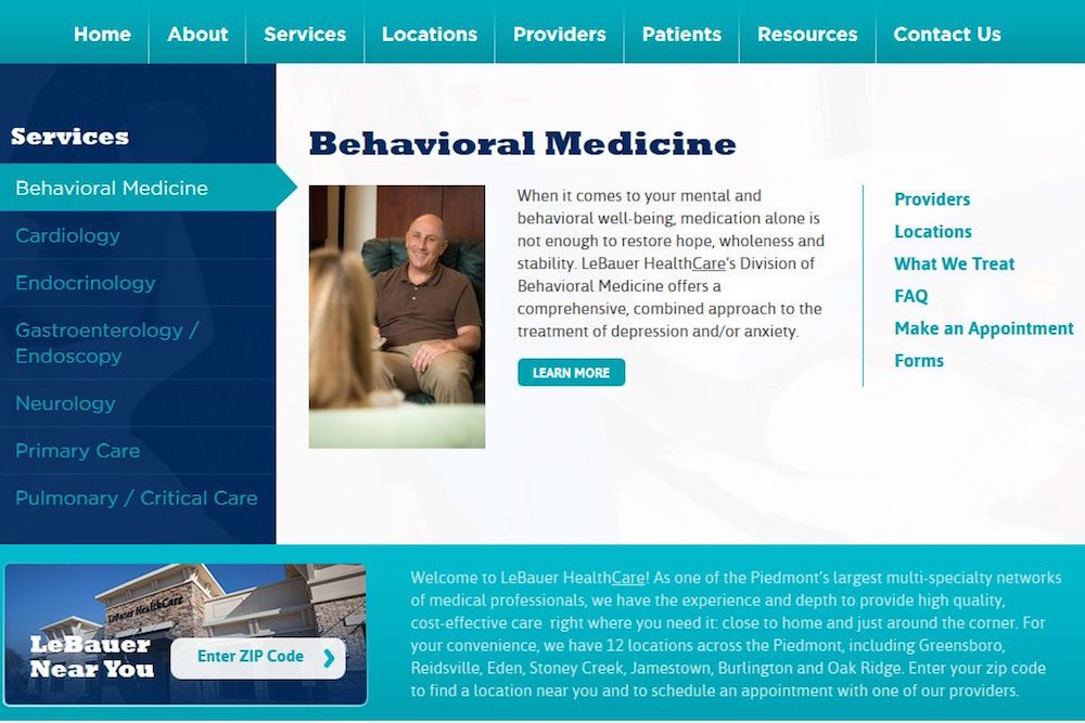
The mega menu serves up focused messaging and targeted menu items related to each of LeBauer’s specialties. The visitor can interact with these extra large menus by hovering over the specialty name. This gives the visitor an area to pull off and read more about a given specialty – straight from the home page. Or they can jump straight into a deeper page to discover more specific information – such as Locations or Providers. If this were done using traditional menus, the visitor would have to wade through three levels of navigation – adding time to the visit without offering the additional information a mega menu affords.
Targeted Call Outs for Website Navigation

Below the mega menu section of the LeBauer site, are three call out sections that allow the visitor to self-identify why they are still reading through the home page. The drop downs on the left, again, show LeBauer’s breadth of coverage and provide immediate access to detailed information about a certain location or specialty. The two large buttons to the right funnel current and future patients through two distinct user experiences: scheduling an appointment and learning more about LeBauer. These targeted call outs use minimal content to deliver targeted, attractive navigation to these two key segments of visitors.
Responsive Website Layouts – Friendship Christian School
Friendship Christian School is a private Christian school in Raleigh, North Carolina. Their responsive website is a prime example of an excellent desktop-to-smart phone menu.
For the uninitiated, responsive websites feature one set of code that works to shift around content depending on the size of the screen. What the user sees on a desktop looks different from what they would see on their smart phone. The need to have even basic navigation work for all screen sizes often presents a challenge.
Desktop to Smart Phone Menu

As shown above, the visitor to Friendship Christian’s website is presented with a list of quick links at the very top of the site and a more traditional navigation set off with a picture showcasing the Athletics section of the site.

Once in “smart phone mode,” the site’s navigation totally changes – rolling up into a menu revealed by touching the arrow. The quick links are still in the grey and the main navigation is kept in the green. While the pictures have been removed, the consistent coloring effectively communicates the two distinct navigation menus in one.
Explore Better Website Navigation Options with North Star Marketing
To learn more about enhanced website and navigation and responsive web development, we invite you to explore our website project gallery and marketing service offerings. Then give us a call at 336.229.6610 or send us an email to start the conversation. Thanks for reading the True North Blog!